Apr 30, 2018
When it comes to accomplishing the perfect kitchen remodel, the new design and build should not only win a homeowner over with your own preferred style but should be custom tailored their family’s particular needs and lifestyle.
Kitchen Kraft works closely with the homeowner and leaves no stone unturned in crafting the perfect kitchen design to address your home’s every aesthetic and need. Starting with the homeowner’s wants, Kitchen Kraft also identifies existing structural or technical obstacles, then accommodates all things form and function for an immaculate interior design that is truly unique to each family and home.
See for yourself in this sneak peek into the before, after, and during of a recent Kitchen Kraft remodeling project in Columbus Ohio.

The existing layout was closed off and did not meet the needs of the growing family. Prep and cooking space was limited. The work triangle was awkward, given the fact that the refrigerator opened into a high traffic area.
An existing closet and pantry that opened into the kitchen also impeded functionality. A seldom used dining space behind the kitchen offered the potential of expanding the kitchen.

Photos of the existing space captured the current work triangle, high traffic areas, and functionality issues. Photos of the existing dining room showed the potential of adding a much desired entertaining space, and expanding the kitchen.
Photos of the closet area inspired a discussion about a better use of the space that would allow for a large island. Pictures of the soffits were also taken, and quotes were requested to relocate mechanicals into the client’s ceiling.

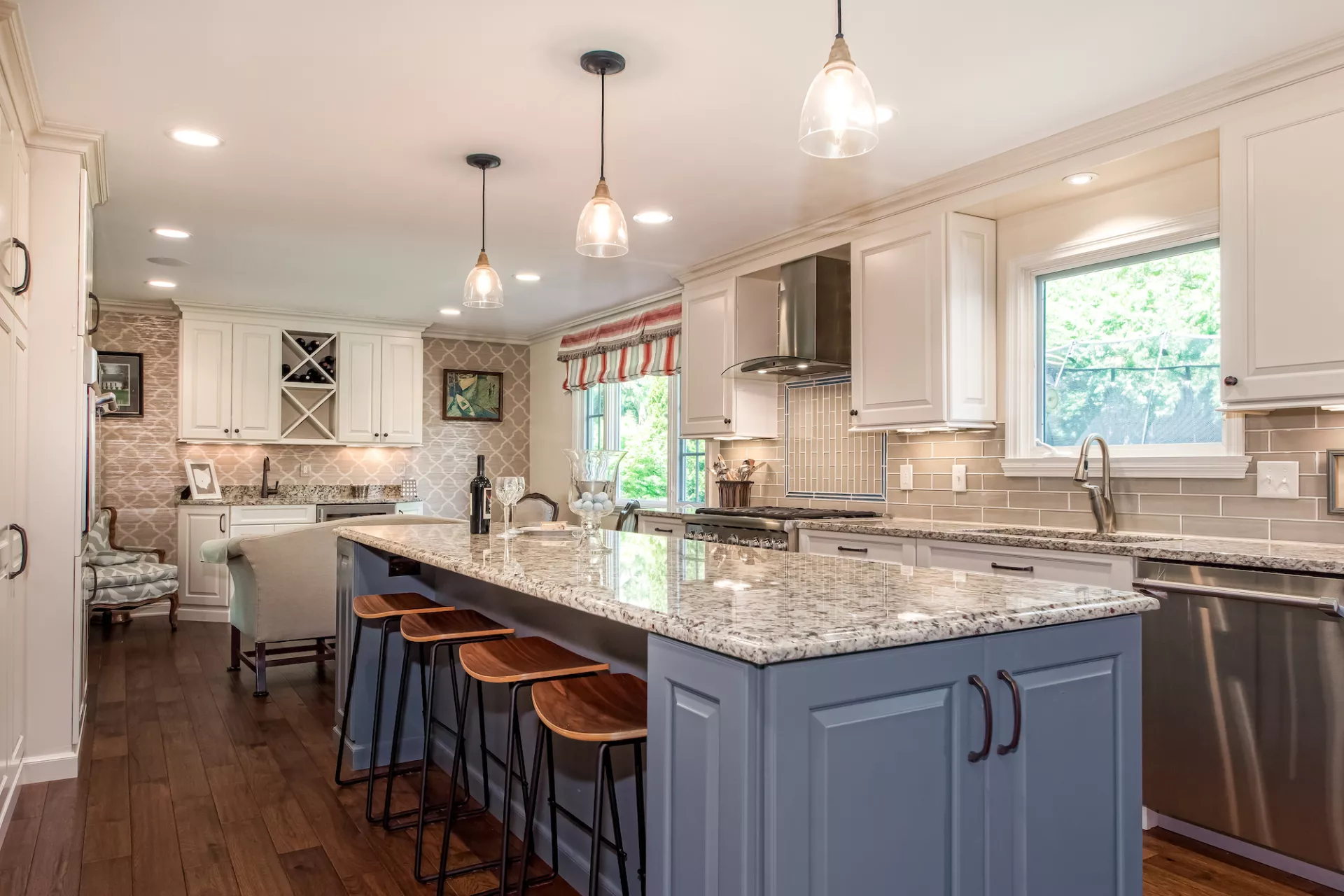
The new proposed layout involved removing the wall between the kitchen and the dining room. The closet and pantry were also removed, and replaced with floor to ceiling cabinets including a butler’s pantry.
The cabinets were not as deep as the pre-existing closet and pantry, which allowed for a large island with seating. The refrigerator was relocated to a low traffic area that fit into the new work triangle.
The prep, cook, and clean-up areas were separated. A second oven was added, as well as a professional grade range. The new entertaining space featured a separate bar with beverage center. A second beverage center was added to the island next to a microwave drawer.
The addition of these two items allowed the client’s active and growing boys to become more self-sufficient. The island was also large enough to prepare dinner and provide space for the boys to do their homework.
 The client loved color, and did not want a white kitchen. A custom cabinet line was selected, that could match the color of the blue tile in the mural above the range. Soft ivory was used for the perimeter cabinet color.
The client also likes reflective surfaces, so a glass backsplash was chosen. This also complimented the warm earth tones in the countertop.
Two piece crown molding was run throughout the newly remodeled area which was the same profile as the rest of the
home. Tying the spaces together.
Additional details include: decorative moldings on the island, seeded glass inserts, and a blue panel inside the glass front cabinets that match the island. Can and pendant lights were added, as well as task and under-cabinet lighting.


Schedule a complimentary consultation at our luxury remodeling showroom with one of our award-winning designers.